YEMA Product Page Redesign
YEMA is a supermarket that offers the healthiest products at the lowest prices in Mexico.

Project Overview
As a startup, gaining trust within the community is vital. To achieve this, we enhanced a crucial aspect of our E-Commerce platform: the product detail section, including verified reviews. We redesigned the Product page for better organization and clarity.
My Role & Responsibilities
As the Head of Design and Experience, I was the ownter of the project. This encompassed conducting stakeholder meetings, conducting user research, and coordinating the UI/UX Team.
Stakeholders:
Consumer Goods Developers
Development Teams
Timeline:
1 month (Jul 2023 - Jul 2023)
Tools:
Figma / Jira / Slack / Google Suite / Miro / Zoom / FullStory / Google Analytics
Location:
CDMX, Mexico
Challenge
Our challenge was clear: refine YEMA's product detail page to meet the evolving needs of our increasingly mobile-oriented user base. This endeavor required a thorough understanding of user behaviors, gleaned through interviews, as well as insights from industry benchmarks. Additionally, we needed to align our strategy with key business objectives, all within the context of a highly competitive market.
Objectives
Add support for Products Bundle and Bulk
Improve Access of secondary information (Nutrition facts, why we love it, etc)
Highlight Product rating
Have an “In Use” image displayed to tempt the users
Add Feature of User Reviews
Add recommendations based on the product
PResearch
We seized the opportunity during this redesign to thoroughly analyze the previous version of the product detail page. This deep dive allowed us to identify areas for improvement and discover new opportunities for enhancement. By incorporating this additional layer of analysis into the original request, we were able to make an even more significant impact with our efforts.
Previous Version Analysis
The main block of the page performs well, and users are accustomed to it. However, there is still some room for improvement in information hierarchy.
The secondary information block occupies too much space, and the user experience should be unified between desktop and mobile.
The product content and price per gram can be grouped and placed alongside the price.
The overall user rating should be communicated in the main block, while the details of all the reviews and the option to leave one create the need for a new information block with lower hierarchy on the page.
The Ballinger font is difficult to read in some cases and works best for headings.
Primary and secondary buttons are too plain, making it challenging to draw attention to required actions."
Findings
As a team we gathered all the Objectives and Analysis, did some round table sessions and come to this solutions
The overall user rating of the product should be as close as possible to the name (Top right, above the name).
In the main block we will keep on the left of the second column the price, and on the right the product content and price per gram.
Change the secondary section to an accordion (like in mobile) and dive the space in 2 columns:
1 for de accordion and 1 to display the nutrition facts or the product in use.Create new components and a layout for the new reviews section
Do some Mid. Fidelity mock ups to choose the candidates internally through A/B testing
For Products recommendations we will re utilize our existing carrousel component, and add it under the secondary section
iterate with the button styles to make em more bold.
Research and iterate with different fonts to define a new style for the body texts.
Final Look
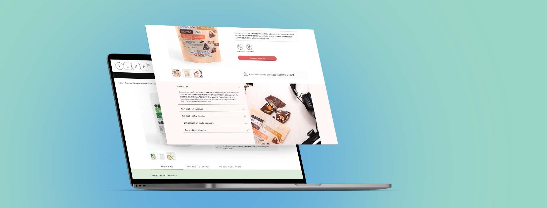
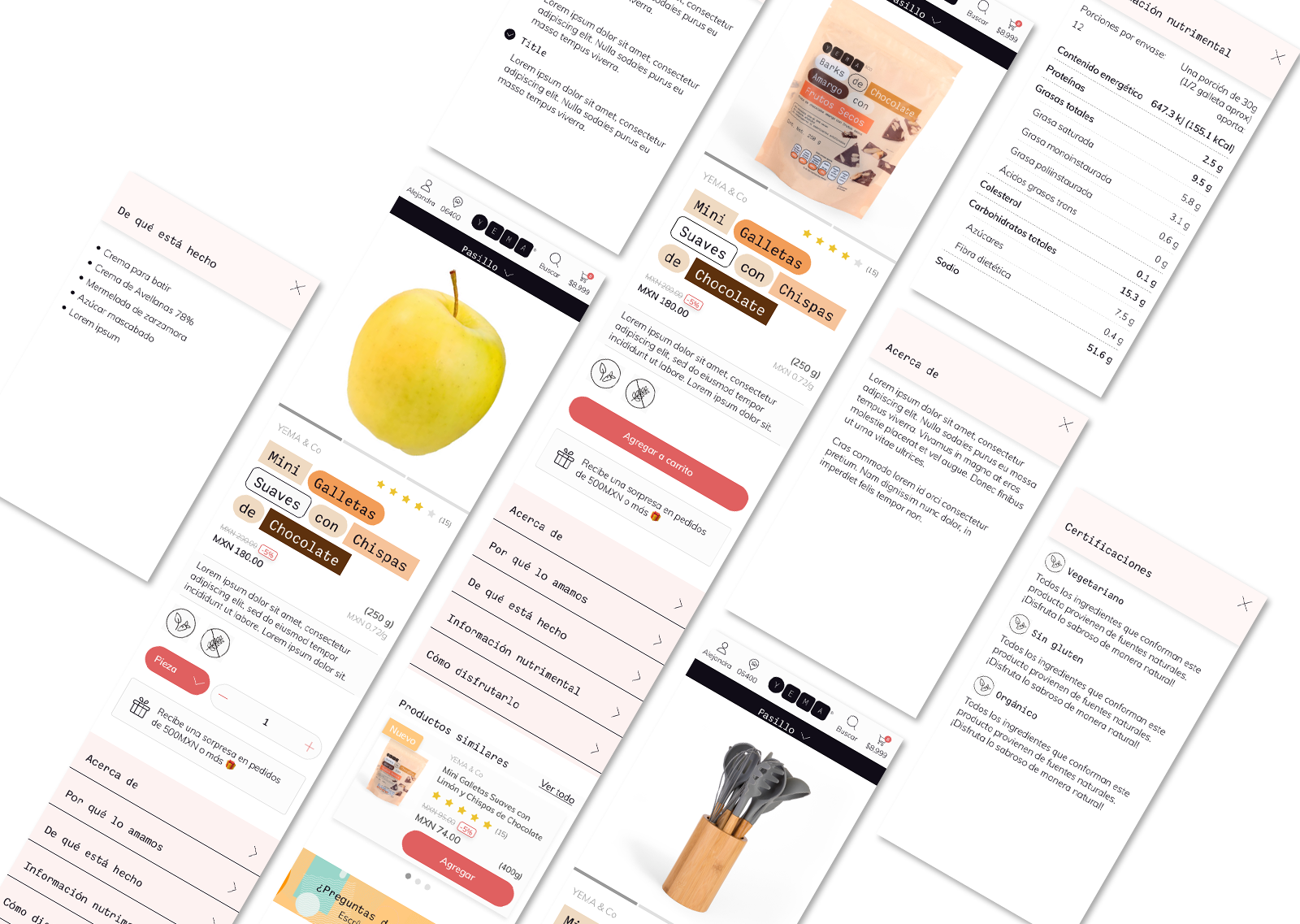
Here are the final designs for the re-designed product page for desktop and mobile.


